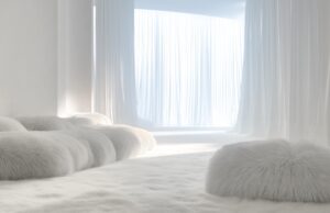
The color of nothingness says everything about where design is heading.

The Pantone Color Institute has long positioned itself as an arbiter of taste and trend forecasting, commanding attention from designers, marketers, and luxury brands alike.
Each carefully curated annual color release captures the emotional and cultural zeitgeist of its moment. From there, the influence ripples outward, shaping design, fashion, and consumer culture on a global scale.
Cloud Dancer, the chosen shade for the year ahead, is one that’s defiantly quiet. A clean, diffused white with none of the clinical chill of gallery walls, nor the creamy warmth of linen. It sits somewhere in-between, embodying what Pantone describes as “a conscious state of simplification.” Boldly, it’s the first time white has ever been chosen.

Its presence in the coveted Color of the Year slot is a subtle admission that maximalism, in all its joyful excess, has finally run its course. For years, it has been the unruly child of the interior design world: loud, unfiltered, and gleefully chaotic. It has marched across homes in dizzying prints and cacophonous color clashes, layering rooms so thickly with personality they were left with little space to breathe.
It has been weaponised in advertising, UX, and particularly on social media, a hyper-connective space where the algorithm rewards spectacle and overstimulation. In many ways, maximalism has mirrored the chaotic pulse of modern life. And like modern life, it has reached a point of fatigue.
See more: The Must-See Moments From Milan Design Week 2025
By contrast, Pantone’s new shade is refreshingly minimalist. “A billowy white imbued with a feeling of serenity,” a “refuge of visual cleanliness” that encourages wellbeing and lightness, it captures a gently shifting cultural pivot – a growing desire for clarity and calm in a world that feels relentlessly loud.
But this renewed embrace of white doesn’t signal a retreat into absence. In the realm of interiors, stripping back color doesn’t mean stripping back character. In fact, it creates a space for everything else to become more intentional, with texture, materials, and light carrying new weight. It demands designers think intentionally and choose pieces that genuinely earn their place in the composition of a space, rather than fade into the background.

Pantone’s color has already caught the attention of forward-thinking brands: the Mandarin Oriental, for example, will reimagine it across 10 unique experiences, ranging from oxygenating spa treatments and sky-high stays, giving guests an immersive opportunity to “see, feel, taste, and touch this enchanting color.” Likewise, Joybird has embraced the trend, introducing it as a color option across 300 modern furniture designs and curated selection of accessories.
What was long dismissed as sterile or unimaginative becomes something else entirely in 2026: a canvas for renewal and reinvention. A color most welcomed for the new year ahead.

Добавить комментарий